
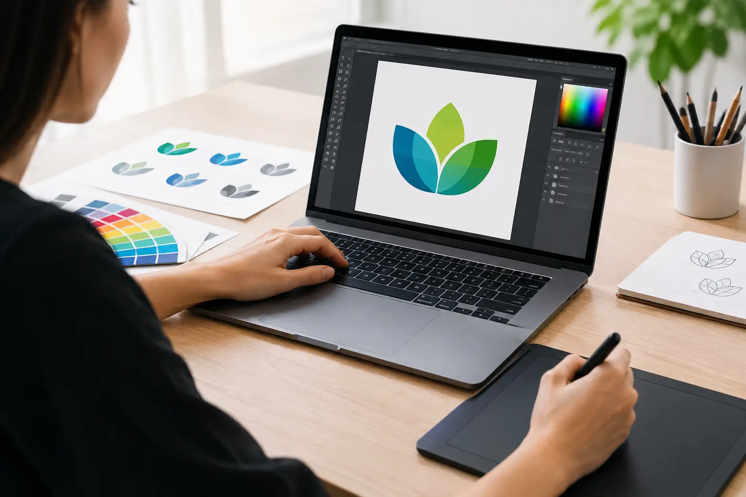
A customer has searched for a local plumber, accountant, café or retailer, then lands on a screen full of similar-looking businesses. Your logo is often the first cue that tells them you are established, capable and worth contacting. Great logo design services do more than make a business look polished. They give people a quick, memorable reason to recognise your name again.
For small and medium Australian businesses, that first impression needs to work hard. Your logo may appear on a website header, Google Business Profile, ute signage, uniforms, invoices, social posts and a tiny mobile screen – sometimes all in the same week. A clever-looking mark that only works in one place is not much help. The goal is a brand asset that looks sharp wherever your customers find you.
A logo is a business tool, not just a pretty graphic
It is tempting to judge a logo on whether it looks flashy. But the strongest logos are usually clear before they are clever. They make the business name easy to read, fit the market they serve and create the right feeling in a matter of seconds.
A family law firm needs a very different visual personality from a coastal burger bar. A building company may need to project reliability and scale, while a new beauty studio might need warmth, personality and a sense of care. Neither approach is automatically better. It depends on what customers expect from the category and what makes your business genuinely different.
That is why a logo should start with a proper conversation, not a random choice from a template library. Before shapes and colours are explored, a designer needs to understand what you sell, who you want to attract, where you operate and how you want people to describe your business after they have dealt with you.
What professional logo design services should deliver
A finished logo is not simply one image file sent by email. It needs to be flexible enough for the real world, including the jobs that arrive months after launch.
A practical logo package generally includes a primary version for your website and larger branding, plus alternative layouts for tighter spaces. For example, a horizontal logo may suit a website menu, while a stacked version can work better on a social profile, flyer or square sign. You may also need a simple icon or monogram for favicons and profile images.
Colour versions matter too. Your full-colour logo should be supported by black, white and single-colour options. This saves headaches when a supplier needs embroidery on work shirts, a sponsor banner has limited printing options, or your logo is placed over a dark photo. If the mark disappears without its original background colour, it has not been designed to travel well.
File formats are the less glamorous part of the job, but they matter. Vector files can be enlarged for vehicle graphics or signage without going fuzzy. Web-ready files keep pages loading neatly and look crisp on mobile. Having the right versions on hand means you are not scrambling to find an old attachment whenever a printer, web developer or marketing partner asks for your logo.
The brief: where good design starts
You do not need to arrive with a fully formed design idea. In fact, being open to expert direction can produce a stronger result. You do need to give clear business context.
Start with the basics: your business name, key services, audience, service area and any tagline that must appear with the logo. Then consider the personality you want to convey. Are you down-to-earth and local? Premium and refined? Fast-moving and energetic? Trusted and traditional? These words give a designer a useful creative lane.
It also helps to share examples of brands you like, but explain why you like them. Perhaps the typography feels confident, the layout is clean or the colours feel fresh. Copying another business is a fast way to look generic, particularly when competitors are targeting the same local customers. References should guide the direction, not become a blueprint.
Be honest about what you do not want as well. If every business in your trade uses a house roof, spanner or map pin, that can be a useful warning. A familiar symbol is not always wrong – recognisability has value – but it needs a distinctive treatment if it is going to stick in customers’ minds.
Choose clarity over cleverness
A logo has a very short window to communicate. Overly detailed illustrations, tiny text and complicated gradients can look impressive on a large screen, then turn into a blur on a mobile or embroidered cap.
Simple does not mean boring. It means the core idea is strong enough to survive at any size. Consider the test: can someone understand the name and recognise the shape when it is reduced to the size of a social media icon? If not, simplifying the design may be the smarter call.
Pick colour with purpose
Colour influences perception, but there is no universal rule that blue means trustworthy or green means eco-friendly. Context matters. A bold orange might be perfect for a youthful food brand and completely wrong for a conservative financial adviser.
Think about your market, not just personal preference. Also consider where the logo will be used. If local competitors all use the same navy-and-grey palette, a thoughtfully chosen alternative could help you stand out. The best choice balances differentiation with a look that still feels believable for your industry.
Common mistakes that cost businesses later
The cheapest option can be expensive when it creates confusion or forces a rebrand a year later. One common issue is choosing a logo based only on what the owner likes, without considering the customer. You should enjoy your brand, of course, but it must also speak to the people you need to win over.
Another is asking too many people for feedback. Input from a business partner or trusted colleague can be useful. A committee of friends, family and staff with competing tastes can send the project in circles. Keep feedback tied to the brief: Does this look credible to our ideal client? Is it easy to read? Does it feel like us?
Business owners can also fall into the trap of trying to explain every service through the logo. Your website, copy and marketing campaigns have room for detail. Your logo does not. It needs to identify the business quickly, then make people want to learn more.
Finally, do not approve a design without seeing it in context. Ask how it looks on a website, social tile, shopfront, business card and light or dark background. A good concept should not depend on a single perfect mock-up.
Make your logo part of a bigger brand presence
Your logo sets the visual direction, but consistency is what builds recognition over time. The same colours, fonts and visual style should flow through your website, social media, email signature, brochures, ads and signage. When every touchpoint looks unrelated, customers may not realise they are dealing with the same business.
This is where working with one capable team can save a fair bit of back-and-forth. Catchy Pages can create a logo with the website and digital marketing picture in mind, so your brand is ready to show up properly online rather than needing to be patched together later.
A logo refresh can also be a smart move for established businesses. You do not always need to throw away brand recognition and start from scratch. Sometimes refining an outdated font, simplifying a busy mark or improving colour contrast is enough to make the business feel current while keeping the familiarity customers already know.
When it is time to invest
If you are launching a business, adding a new service, moving into a more competitive market or building a proper website, professional design is worth considering early. Starting with a clear visual identity makes later decisions faster, from choosing a website style to ordering uniforms and running advertisements.
The right logo will not win every sale on its own. Great service, clear offers and a well-built website still do the heavy lifting. But it gives all of that work a recognisable face. Give your business a mark you are proud to put on the front door, the work ute and every screen your next customer sees.