
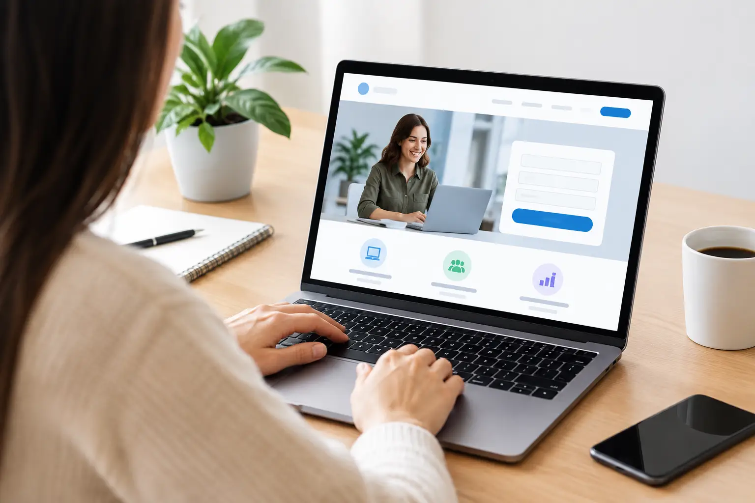
A paid ad click is a costly thing to waste. If someone has searched for an electrician, booked a quote, or tapped through from your social ad, they should land on a page built for that exact next step – not your homepage with 17 places to wander off to. Knowing how to build landing pages that turn interest into enquiries can make every marketing dollar work harder.
For small Australian businesses, a strong landing page does not need flashy tricks or enterprise-level tech. It needs one clear offer, a credible reason to choose you, and a dead-simple way to get in touch. Here is how to put one together without making it harder than it needs to be.
Start with one job for the page
A landing page should have a single purpose. That might be requesting a quote, booking a consultation, claiming a special offer, downloading a guide, or calling your team. Trying to achieve all of those goals at once usually creates a page that does none of them particularly well.
Before choosing colours, photos or fonts, write this sentence: “When visitors reach this page, I want them to…” Finish it with one action. That action becomes the focus of your headline, call-to-action button, form and follow-up process.
For example, a Ballina plumber running a Google Ads campaign for blocked drains could create a dedicated page encouraging visitors to “Book urgent drain help”. A generic homepage may still be useful, but it is not as relevant to someone who needs a fix today. Relevance is what keeps people moving forward.
Match the message that brought people in
Your landing page should feel like the natural continuation of the ad, social post, email or search result that sent visitors there. If your ad promises “Fixed-price air-conditioning installation”, lead with that promise on the page. Do not make people hunt for it under a broad headline about quality service.
This is known as message matching, and it is one of the simplest ways to improve conversions. People click because something caught their attention. Confirm they are in the right place straight away.
Your main headline should answer three quiet questions in a few seconds: What is this? Is it for me? Why should I care? A local accountant, for instance, could use: “Straightforward tax returns for Ballina sole traders.” It is specific, local and useful. “Welcome to our website” is none of those things.
Under the headline, add a short supporting sentence that explains the practical benefit. Keep it grounded. Rather than claiming to be the best in the business, say what clients get: fast turnaround, clear pricing, local support, a free site visit, or a no-obligation quote.
How to build landing pages around a clear offer
The offer is the reason someone acts now rather than returning to their day. It does not always mean a discount. For many service businesses, a prompt callback, free measure and quote, first consultation, availability check or fixed-price assessment is more valuable than knocking a few dollars off.
Make the offer easy to understand and easy to trust. Be clear about what is included, who it suits and whether any conditions apply. If you offer a free quote, say whether it is onsite, over the phone or via photos. If a deal has an end date, use a real one. Made-up urgency can feel a bit dodgy and can chip away at trust.
A good offer also fits the buying stage. Someone looking for emergency pest control may be ready to call immediately. Someone considering a website refresh may prefer a free strategy chat or examples of recent work before handing over their details. There is no one-size-fits-all button.
Write copy that answers objections
Most business owners know their customers’ common concerns already. They hear them on calls every week: “How much will it cost?”, “How soon can you come out?”, “Do you service my area?”, “Will this disrupt my business?”, or “Can I trust you with the job?” Your landing page should answer these questions before visitors need to ask.
Use short sections of plain English copy. Explain your process, your service area, expected turnaround and what happens after a person submits the form. This is not the place for a long company history. Keep the focus on the customer’s problem and the practical result they want.
Proof matters too. Add genuine testimonials, review snippets, project photos, qualifications, licences, industry memberships or recognisable clients where relevant. A builder can show completed renovations. A bookkeeper can mention secure processes and years supporting local businesses. A retailer can highlight delivery times and returns. Specific proof beats vague promises every time.
Make the next step ridiculously easy
If you want enquiries, do not hide the enquiry button halfway down the page. Place a clear call to action near the top, then repeat it after key sections for people who need more reassurance before acting.
Use action-led button text. “Get My Free Quote”, “Book a Site Visit” and “Check Availability” are stronger than a generic “Submit”. The button should clearly signal what happens next, especially on mobile where visitors are making a quick decision with one thumb.
Your form should ask only for information your team genuinely needs at this stage. For a standard quote request, name, phone number, email, suburb and a short description of the job may be plenty. Asking for a full life story can send otherwise keen leads packing.
There are exceptions. A commercial fit-out quote, legal matter or finance application may need more detail upfront to qualify leads properly. The trade-off is worth considering: shorter forms usually produce more enquiries, while longer forms can produce fewer but better-qualified ones. Test what suits your team’s capacity and sales process.
Do not forget the thank-you page or confirmation message. Tell people their enquiry has been received, when they can expect a response and what to do if their need is urgent. A simple confirmation removes uncertainty and makes your business feel organised from the first interaction.
Design for mobile first, not desktop second
Most local-service traffic comes from mobile, especially when people are searching between jobs, at home after hours or standing in front of a problem that needs solving. Your page must look sharp and work properly on a phone.
Keep the layout clean. Use a readable font size, generous spacing, clear contrast and compressed images that load quickly. Put your phone number where it can be tapped, and make the main call to action obvious without endless scrolling. Avoid pop-ups that cover the screen or autoplay videos that chew through mobile data.
A landing page does not need to look bare, but every element should earn its place. If a large image, animation or extra menu item does not build confidence or help visitors act, it may be getting in the way. Navigation is another judgement call. Removing it can keep people focused, while retaining a simple menu may reassure visitors who want to check your wider business. For campaigns with a very specific offer, less distraction generally wins.
Measure what happens after launch
Publishing a landing page is the start of the work, not the finish line. Track the actions that matter: form submissions, calls, bookings and qualified enquiries. Traffic alone does not pay the bills.
Look at where visitors arrive from and how each source performs. Google search traffic often behaves differently from Facebook or Instagram traffic. A campaign aimed at people actively searching for a service can support a direct quote request. Social advertising may need a softer first step, such as an offer, consultation or helpful resource.
When testing improvements, change one meaningful thing at a time. Try a sharper headline, a different offer, a shorter form or a stronger proof section. Give the page enough traffic to produce a useful pattern before declaring a winner. A handful of visits is not a trend.
Also check lead quality with the people answering the phones. If a page creates plenty of enquiries but they are all outside your service area or after something you do not provide, the issue may be the targeting or wording, not the page design.
Give every campaign a proper destination
A good landing page makes your marketing easier to judge and easier to improve. It gives prospective customers a clear path, gives your team cleaner enquiries, and gives your advertising a fair chance to earn its keep.
If the moving parts feel like a lot, that is where a local team can help. Catchy Pages builds show-stopping websites and focused campaign pages with the copy, design, hosting and marketing know-how under one roof. Start with the customer action you want, make it clear, then keep improving from the real results rolling in.